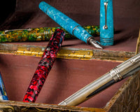
Let us continue our celebration of February as the month for expressing our affections. As my previous post was about letter-writing and its attendant delights, we should also appraise the tools used. As one of the ingredients essential to letter-writing, inks deserve their own consideration. Given the multitude of choices available to us, we are limited only by our proclivities and pocketbook.
I have always been partial to inks on the wetter side, to pair suitably with my chosen pens. Using mostly fine nibs helps me focus on my handwriting; and on improving the letterforms. Drawing with these produces those precise lines I prefer for my art. Particular inks also appeal to me because of their colour, shading, and/or sheen. Personally, I gravitate towards those with more sublime, tempered colours which are soothing. Inks with delicate shimmer and interesting sheen are primarily chosen for their artistic use. That visual first impression exerts an important influence. Water resistance is another factor, essential for those foundational lines for sketching. Those that aren’t as water-resistant are beneficial as well for ink washes, and for exploring chromatography during my creative process.
Here are my chosen 5 inks for February. These have been selected mainly for their attributes, in addition to their potential use for penning a caring letter AND making a warmhearted sketch or two to share with that special friend, if I so desire.
#1 - Graf von Faber-Castell Stone Grey
- a medium grey ink
- moderately wet, moderately saturated
- good shading, not sheening
- no feathering or bleeding on MD/Midori and Tomoe River paper (TRP)
- dry time: about 30 seconds
- moderately water-resistant
- This is one of my favourite greys, classic enough for writing but with a touch of character.
- a dark, brownish red ink
- moderately wet, moderately saturated
- shading seen using broader nibs, with greenish sheen on ink drops
- no feathering or bleeding (MD, TRP)
- dry time: about 15 seconds
- no water resistance
- This is my first red, deep and dark enough for that vintage aesthetic.
#3 - Sailor Shikiori Tokiwamatsu
- a medium forest green when wet, dries to medium olive green
- moderately wet, moderately saturated
- shading seen using broader nibs, and dark red sheen
- no feathering or bleeding (MD, TRP)
- dry time: about 20 seconds
- minimal water resistance, with blue ink component seen
- This is my constant green that lends a formality to my writing, with a flexibility applicable to sketching.
#4 - Pilot Iroshizuku Tsukushi
- a medium brown with a reddish tinge
- moderately wet, moderately saturated
- shading more evident with broader nibs, and greenish sheen
- no feathering or bleeding (MD, TRP)
- dry time: about 20 seconds
- minimal water resistance, with grey ink base seen
- I like this specific shade, as well as how it looks differently depending on the paper used.
#5 - Sailor Pigment Ink Kiwa-guro
- a deep, shiny black
- a bit drier more than wet, highly saturated
- no shading or sheen
- no feathering or bleeding (MD, TRP)
- dry time: about 30 seconds
- high water resistance
- This is an intense black, perfect for more professional writing and necessary for drawing where permanence is essential.
I hope you’ll be able to try these inks. They are generally well-behaved inks, but using them with the proper pen and paper enhances your experience. Their properties lend them a versatility that can be applied both for correspondence and art. Have fun exploring: write a letter and/or create a sketch, then send out to the one that you exceptionally care for.
Use the code LEKZ10 to get a 10% discount!
* Not applicable for HopDrop, Clearance, On Sale items, and select brands.
Written by @lekzumali
Check out her musings on Instagram!


