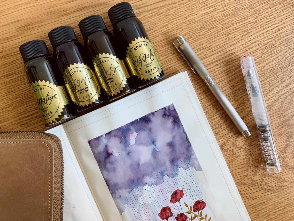
Back when I was still starting on my fountain pen journey, I researched on what pens and inks were usually recommended. Among those prominently mentioned, Robert Oster Signature Inks kept coming up. Since then, the name has always been on my radar. When the opportunity came for me to purchase my first bottle, I truly had a hard time selecting from the wonderful, promising ink colours. That first choice was enough though, to make me want more.
Robert Oster Signature Inks were born from the maker’s love for the colours native to Australia, from its natural resources, weather, wine, to local scenic spots. It’s no wonder that so many colours (more than 200!) have been formulated. The ink bottles are manufactured from recycled materials, and are conveniently wide-mouthed. The tight-sealing cap doesn’t leak; and the deceptively simple bottle holds 50 ml of ink. That little swatch of ink on the sticker of the bottle’s cap is a nice, personal touch. The price at 17 - 24USD may not be the most affordable for someone just beginning to explore fountain pen inks, but the quality does speak for itself.

Ever since I’ve started using fountain pen inks as my primary medium for art, I find myself gravitating towards those with muted colours, and that exhibit interesting chromatography when mixed with water. These elements can readily be found in Robert Oster Signature Inks. The challenge would be to handpick which ones to play with.
Here are a few inks I’ve tried:

Summer Storm - a subtle, blue-grey ink that goes on greyish then dries to a bluer hue, with purple undertones
- wet, with good flow; no feathering or bleedthrough on MD/Tomoe River Paper
- high shading, no sheen
- no water resistance

Charcoal - a dark grey ink with strong purple undertones, looks different on different papers
- a bit dry in fine nibs, average flow, no feathering or bleedthrough
- medium shading more evident in broader nibs, no sheen
- low water resistance

Smokescreen - another greyish ink (yes, I have a weakness for greys...) that leans towards a dusky old rose, reminiscent of dried flowers; goes on more mauve, then dries to a more brownish pink
- a bit dry in fine nibs, still with good flow, no feathering or bleedthrough
- medium shading more evident in broader nibs, no sheen
- no water resistance

Motor Oil - a deep, greenish-brown ink (...and murky colours too) that lives up to its name
- wet. with good flow, no feathering or bleedthrough
- low shading, no sheen
- low water resistance

Caffe Crema - a warm, golden-brown ink, aptly named
- wet, with good flow, no feathering or bleedthrough
- medium shading, with a slight silvery sheen where ink has pooled
- low water resistance

Gold Antiqua - a yellowish brown ink, recalls the old gold found in renaissance paintings
- wet, with good flow, no feathering or bleedthrough
- high shading, no sheen
- low water resistance

Fire & Ice - a vibrant turquoise blue cleverly combined with magenta sheen, no wonder it’s one of this brand’s most iconic inks
- wet, with good flow, no feathering or bleedthrough
- high shading, medium sheen
- low water resistance

Astorquiza Rot - a deep, brownish-red, with a unique name inspired by Claudia Astorquiza, who introduced these inks internationally, and “rot”, which is German for red
- wet, with good flow, no feathering or bleedthrough
- medium shading, with a slight dark brown sheen where ink has pooled
- low water resistance

Robert Oster Inks are generally known to be well-behaved. The variety of colours available, as well as the unique properties of some inks, are worth exploring. I’m looking forward to new formulations with more water resistance. This attractive line of inks is a testament to and celebration of inspiration discovered and harnessed well.

Use the code LEKZ10 to get a 10% discount!
* Not applicable for HopDrop, Clearance, On Sale items, and select brands.
Written by @lekzumali
Check out her musings on Instagram!


