
Community, in the deeper sense of the word, is defined as the fellowship shared between a group of individuals. This supportive relationship between like minds includes the dynamic sharing of ideas, attitudes, and goals that all seek to better the person and the body as a whole.
The fountain pen community has always proven to be a lively venue for expressing our love for the hobby as well as sharing our own experiences with our pens. This energetic exchange of ideas and insights helps foster our relationships with each other, from the user, to the creatives, and the retailers in between. With this perspective, EndlessPens presents this dialogue between the fountain pen user and the fountain pen maker. Our aim is to provide a holistic view of the people beyond the product, from the enthusiast to the maker. After all, it is the story woven into it that lends greater value to any object.
Lorraine's Review

Lorraine is a renowned calligrapher within and caring Vice-President of Fountain Pen Network Philippines. Her work is eminent in the local group’s page for providing inspiration to the other members and “oohs” and “aahs” whenever she shares beautiful song lyrics done in her lovely “Lorraine Hand”. More of her craft can be found in her Instagram @calligraphyspot.
Pen design / aesthetics:
What I like:
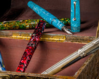
I like the way the pens look: slick, modern, and I can't decide whether I like the matte or shiny versions better! I like their weight in hand, and their size- not too large, not too small. I appreciate that they feel of high quality, unlike many other available options for modern calligraphy pens.
The pens have an obvious prominent step-down from barrel to section, but this did not bother me. I like the brass section, the anti-roll flat section, and that care was put into including the company name on the section, as well as custom engraving on the nib.
What can be improved:
For both the steel flex (silver) and the titanium flex (matte black) pens, the section seems very slightly misaligned when the pen is closed, which may bother finicky customers. For the untipped calligraphy pen (brown), it is quite misaligned.
On the titanium nib, the engraved text is off-set from the center. Again, this would probably only bother finicky users.
The nibs:
The titanium flex nib felt softest and smoothest and easiest to use. Good flex, but less line variation than the other two.
The steel flex nib felt like a happy medium- certainly firmer and less smooth than the titanium, but with a nice fine line when unflexed, which allowed me to create some good line variation.
The untipped calligraphy nib is what I had trouble with at first- it felt very scratchy and was tearing my paper when I tried to write at any angle. I asked a local nibmeister to have a look at it, and he adjusted the tines, which were slightly criss-crossed over. After he had made adjustments, I was able to write -- but very carefully. The nib required an extremely light hand on ovals, swoops, and upstrokes. Flexing beyond a certain point was also impossible, as the nib would cut the paper with too much pressure.
Writing experience / final thoughts:
I experienced zero problems with inkflow in any of my writing tests, which I know is not an easy thing when it comes to flexible-nibbed fountain pens, so I was quite pleased with that!
The titanium flex had a lovely smoothness to it, and thus was my favourite -- but that's because I'm less concerned with line variation than other calligraphers.
I suspect the steel flex will be most popular -- and rightly so, as the happy medium I mentioned earlier.
The untipped calligraphy nib, imho, needs a bit of tweaking. I'm not sure if it would work better with a wetter or more lubricated ink, but it definitely needs an expert hand that will hold the nib at the proper angle to the paper baseline, so that the nib doesn't get misaligned.
I am always VERY excited to find pen makers like The Good Blue who create modern options for flex calligraphy, and appreciate that these pens are available at fairly affordable prices. I love that the pens don't look cheap, or like an afterthought. These are pens I'd be happy to have in my collection.
Thanks very much for letting me try these pens and nibs!
Sunil's Response

Sunil is the designer and engineer behind the London-based company The Good Blue Co. He has had experience with fountain pens since he was in primary school. To him, the desire for a fountain pen that fit his particular needs led him to experiment and create these fountain pens, and eventually share it with the rest of the community. The Good Blue Co. aims to provide fountain pens that are well-made for everyday use, driven by the concept that form follows function.
Pen assembly design
Glad this was well received -- we put a lot of thought into the ergonomics -- particularly having a neutral balance to the pen. We used 3D printing for our initial prototypes -- it's super fast and we cycled through 6 design iterations in 4 weeks! Sampling on the CNC in aluminium and brass was the next step. For this, we had to fully redesign the threading. Because the flat-plane roll stop runs across three components, the threads have to be 'timed' precisely so that they line up every time the pen is put together. We borrowed this machining technique from Swiss watchmakers - this is how the escapement mechanism in watches is machined.
Many folks notice the step down and comment that it seems large, but most folks seem comfortable with the pen when they write with it. This business of the section step down is quite a personal choice, and quite polarising, but we wanted to maintain the clean lines of the design and not have the cap diameter larger than the barrel, hence this design choice. The overall form of the pen is a single elliptical curve rotated to form a solid body. (The radius of the major axis of this curve is what gives the pen its model number, R615)
Alignment of the flat plane
The flats should be aligned bang on or be very minimally off (even though the threads are metal, there's a little 'give' in terms of how 'tight' individuals torque the assembly closed)
The brown pen is a pre-production sample - I sent it to Micah 'cause it was brown - flats not lining up on this one is a known issue. Each different colour anodise depth varies so the alignment has to be 'dialed in' for each colour when we go to production.
Ink delivery
Glad you enjoyed how the feeds performed - we've worked very hard on inkflow - and I think it's dialed in quite well with the nib units behaving well for everyday writing (no gushing or burping) but at the same time happy to keep up with demand for flex lines. We use a modern engineering polymer for the feeds - this provides a very consistent bulk material (compared to say ebonite, which is a natural material and quite inconsistent in its bulk properties). We use laser sintering to create a hydrophilic surface for the feeds. This encourages inkflow and also holds ink on the feed surface through 'adsorption'. So the feed can keep up with even the most demanding flex lines, and is happy with super saturated, pigmented inks and particulates in shimmer inks as well.
Nibs
Interesting to have your feedback re the titanium nib: Generally, I find this to be softer and easier to flex than the steel, with greater line variation. I find that the nib does get a bit softer with use, and so we do tune these nibs with a very tight tine gap when they go out.
Agree re: the untipped calligraphy nib -- because it's untipped, there are far more challenges with alignment and as you say it requires a very light hand (specially on the upstrokes). We are thinking a lot about the future of this nib as it is very niche. I think we will slowly phase this out and perhaps design a slightly different feed to allow for use of the pen with standard pointed pen nibs (like the G nibs etc). There's some different challenges there with managing corrosion from the pointed pen nibs and making sure the feed is not compromised over time, so this won't be a quick-fix project!
Also your thoughts around the tipping and how 'smooth' the nibs feel -- by default a little more care goes into the polishing of the tipping on the Ti nibs (because they are more expensive) -- so we get them feeling a lot 'smoother' vs the tipping on the steel nibs. We can certainly tune and make the steel smoother -- it will add a little cost, but is something I have been considering. Having said that, some folks like the little feedback from the nibs (it makes it easier to control the fine upstrokes immediately after the juicy flex strokes). But of course, many folks prefer to have a much smoother feel to their nib.
Engrave
Ah -- that's interesting about the nib engrave not being centered -- something to look into for me here -- I've not had that feedback before, and we have a standard jig where we load up the nibs and then they get lasered, so in theory it should be bang on perfect. I'll pull a handful of nibs now and spot check.
Thanks again, and much appreciated -- any feedback is very welcome as are any suggestions; I'm looking to constantly refine and improve the pen and the ink delivery!
Final Thoughts
This kind of dialogue between the fountain pen user in the form of a review and the maker’s response which also offers greater insight into the creative process is refreshing, and provides better understanding for the rest of the community. This is particularly helpful for those who are interested in trying out this product.
Lorraine’s insights as a long-time fountain pen enthusiast and expert calligrapher provides more focus. She shares her experience with the specific aspects of the R615 fountain pens that would be of great interest to those of us who are looking to try these particular types of pens. Furthermore, Sunil’s perspective from his position as the craftsman helps us understand how these models were made and appreciate why each component of the pen provides a different user experience. His consideration of Lorraine’s experience allows us to look forward to the possibility of further refinement in the future.
This kind of open collaboration within the spectrum of the hobby is encouraging for the whole community, as it gives us all the opportunity for feedback and potential for further improvement. Thank you both Lorraine and Sunil for sharing with us your observations and acumen. We’re looking forward to better fountain pens that will be born from this exchange of ideas.

Use the code LEKZ10 to get a 10% discount!
* Not applicable for HopDrop, Clearance, On Sale items, and select brands.
Written by @lekzumali
Check out her musings on Instagram!


2 comments
Mizi Horwood
I was surprised at the comments one person left about Sunil from the Good Blue . I have purchased a few of his pens and at least ten of his fine flex nibs . All I can tell you that the pens and all 10 fine flex and calligraphy nibs are the most fantastic writers , so much so that I have evenx put them on my Leonardo and Esterbrook Estie pens Sunil has been most helpful and willing to engage with his customers and I really appreciate the work he has been putting in to give us all some great writing experience s
James
I bought this pen from Sunil.
2 months wait for a R3600 pen that doesn’t write.
And once you’ve paid, forget about getting replies to emails.
Seriously stay away from Sunil and his crap pens.